Having an architect for a father left its mark on me. I was never likely to follow his route into a profession that demanded greater skill in technical drawing than I could ever hope to muster, but through him I certainly inherited a love of beautiful buildings and an interest for what buildings go where, how and why. He often designed schools, warehouses, parts of hospitals, offices, shops and conversions, and later was responsible for the design of architectural aluminium curtain walling for office blocks and shopping malls.
Nothing especially grandiloquent, but his work will have been quietly going about its business these past 40-50 years. You might equally say that not all good architecture needs to be on a vast scale, but some examples quoted here show you can do good work on a budget – though whether these designs meet your criteria for good architecture is more debatable. Ultimately it is like all art – highly individual and in the eyes of the beholder.
There might be a great deal of subjectivity about what makes for inspiring or acceptable architecture, but to me a good building combines a practical functionalism with an elegance and simplicity of design; my dad’s view was that many modern designs to one or the other, or often neither. Prince Charles is the oft-cited example of a man with influence but little knowledge, who spouts forth at regular intervals to rile the great and good at the RIBA. He hates “monstrous carbuncles” and “glass stumps” – and in that he would have many supporters.
There is some truth in the PoW’s comments, along with much tosh. In isolation, modern designs can be hideous and fail to stand the test of time (60s office blocks spring to mind), though there are very many that look simply breathtaking. But you can’t keep building neo-classical kitsch forever. Design moves on, and it is the approach to new design that makes all the difference.
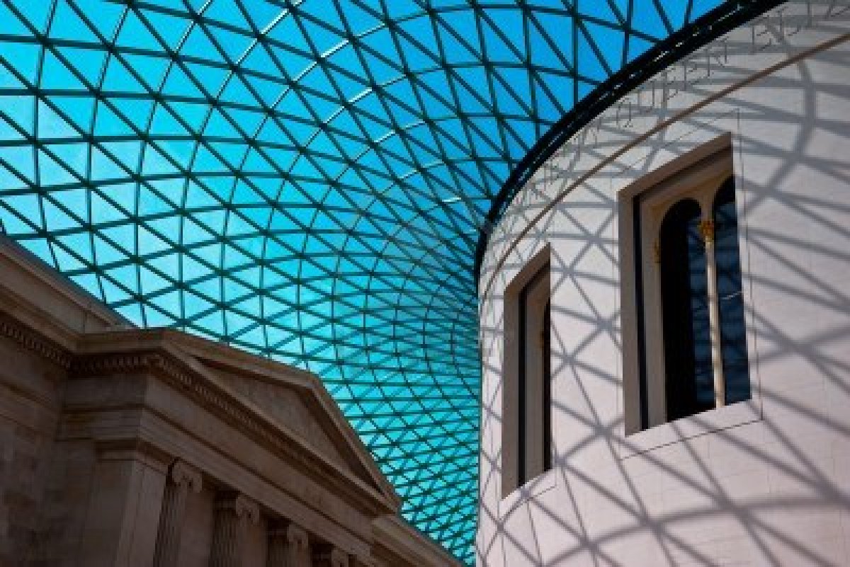
In context, some designs that spin modern forms against old buildings can work brilliantly, such as the pyramid at the Louvre or the atrium at the British Museum, but all too often old and new sit in uncomfortable juxtaposition. It’s nothing new to add modern touches to old buildings, but to work it needs a very sure and sympathetic touch.
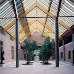
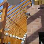
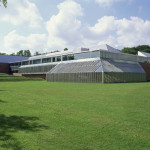
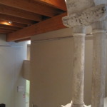
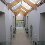
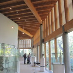
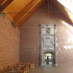
One that appeals greatly to me, and which merges old and new brilliantly, is the museum housing the Burrell Collection in Glasgow. The last time I visited was in 2010 in glorious sunshine. The first thing you notice is that it is a building communing to perfection with its environment in Pollok Park. Secondly, you notice the nods to the Baroque and Gothic architecture, which in turn reflect some of the eclectic art housed in the collection. But most of all, I adore the use of natural sunlight and angular forms of beams used to create patterns of light on the corridors. It is a thing of great beauty which is perfect in its own right and yet subservient to the works of art within. Would that every building could achieve its goal with such brilliance – yet this was one example of the architects (Gasson, Anderson and Meunier) winning a competition sponsored by the City to showcase the works collected and donated by Sir William Burrell. And guess what – it’s now Grade A listed:
Cabinet Secretary for Culture and External Affairs Fiona Hyslop called the building “a masterpiece of structural design….The Burrell Collection is one of Glasgow and Scotland’s most impressive buildings of its period and has contributed so much to our understanding of design thinking and the innovative use of interior and exterior space. The A-listing for the Burrell Collection is a fitting tribute especially in this its 30th year and recognises the significant contribution it has made to Glasgow’s landscape and the aesthetic pleasure it has brought to many over the years.”
Category A status is the highest level of architectural protection given to buildings, and makes up about 8% of 47,600 listings in Scotland. It is awarded to buildings which Historic Scotland determine have “national or international importance, either architectural or historic”.
Clare Price, conservation advisor with The Twentieth Century Society, said: “We believe the Burrell Collection represents a unique contribution to twentieth century architecture in Scotland and to museum design internationally. The building’s strength lies in its design: complementing the collection rather than competing with it, its sensitive palette of materials allowing it to blend with the landscape.”
There’s no doubt that there have always been good, bad and indifferent buildings built in every era. In defiance of the rule mentioned above some are highly ornate and make a statement in their own right. How we approach these buildings says much about our era and the relative confidence of those who commission them. There’s no doubt Frank Gehry is responsible for some of the most striking buildings and some of the most awful turkeys too, which goes to show the risk taken by sponsors when they brief charismatic architects and sponsor them to the tune of whatever it takes to build statements across whichever city it happens to be.
Take the new library in Birmingham for example (see here and here.) Compared to the brutalist 60s library in pre-stressed concrete it is a masterpiece, but it will not please everybody, consisting as it does of boxes in grey and gold wrapped in a woven geometric design of metal railings, making it look like Christmas presents stacked ready for opening. Quoting the Guardian article:
On a cloudy day, the library’s oversized chain-mail looms menacingly above the square like a heavy suit of armour, or – as one passerby puts it – a big pair of lacy pants.
Inside it is a paragon of virtue, light and charm, the very essence of a modern library, complete with elegant reading rooms and jazzy escalators. Whatever the external characteristics of a building, its inside must convey a sense of functional integrity and an ambience fitting to the main purpose, something the Birmingham library seems to have achieved in spades. This is a far cry from the days when architects routinely put their grand vision ahead of the needs of people – and much 60s and 70s architecture fits that category.
60s Brutalism has much to answer for, not least the blocks of flats in Hulme, Manchester, which are now being demolished for designs on a more human scale. Some 60s designs won many awards, like Goldfinger’s Trellick Tower and whichever Liverpool building I used to see regularly, a fairy castle in pre-stressed concrete, complete with turrets and flying buttresses – a far cry from the elegance of the new Catholic cathedral, for example – though many disagree about that too.
Some Victorian projects were the equivalent Gehry masterpieces of their day, and unlike much 60s architecture have often withstood the test of time. I adore Sir George Gilbert Scott‘s masterpiece, the Midland Grand Hotel at St Pancras Station in London, which is every bit as much a gothic fairy castle as the one in Liverpool I lambasted, but it has poise and elegance I lambasted above. In Gehry’s case buildings look like anything but buildings, but in traditional designs they have symmetry, appropriate scale and clear functional priority. You could of course say the same about Wren’s design for St Paul’s Cathedral – technically unique in its day but the ultimate in classical church architecture.
Looking at the work of Charles Rennie Mackintosh and Antoni Gaudi you can see they were light years ahead of their time, to the extent that their buildings look fresh and modern to this day. Genius is being visionary, inspiring through great design though not at the expense of the users – and both Gaudi and Mackintosh were accused of having the comfort of the user well down the list of their criteria. That their work is distinctive, sustainable beyond the stylistic norms of any one era, and sufficiently iconic that it is reproduced on postcards, on websites, on posters everywhere tells you something.
I’ll also admit a love of Art Deco architecture too, such as a pub I used to frequent in student days, the Test Match Inn in West Bridgford, and 30s cinemas such as the Embassy at Braintree, now converted to a Wetherspoons pub.
Conversely, you get bad architecture in any age and in any town or city – either bad ideas with insufficient thought in the design and build (see here) and the downright ugly (see here and here and here), though the vision of the sponsor in their brief and budget is every bit as important as that of the architect.
Of these, the National Library in Pristina, Kosovo takes some beating. It was apparently designed by Croatian architect Andrija Mutnjakovic and opened in 1982, but meets no standards of aesthetic beauty I ever came across, even without the brain-like protrusions exploding from within. That must be East European brutalism. Maybe in a kitsch way people will grow to like it in spite of its looks, but at some point it will come down by universal demand and be replaced by something new and hopefully more inspirational – the next generation of library designs in the tradition that gave us Birmingham, maybe?
The knack is for us to appreciate buildings and contribute to feedback encouraging those who commission, design and build them to be imaginative but empathetic – design for people first and foremost.
PS. This is a fascinating analysis of the best of postwar British architecture, though not every building survives that period so well.
[counterize]

